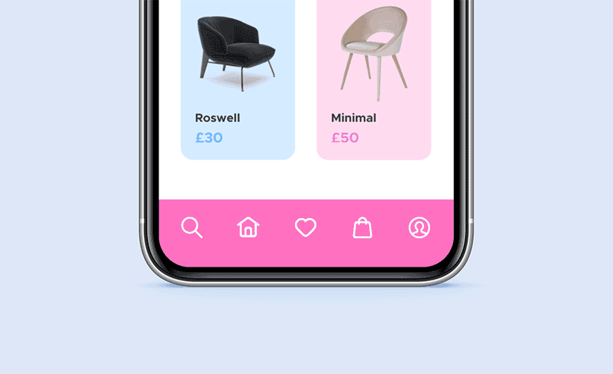
Fluid motion nav
Experimenting with fluid motion for a navigation menu using 'roughen edges' effect in After Effects. This example shows how elements can be set up to automatically transition between each other when navigating between screens. The fluid effect can also be created with code by using CSS and SVG filters or JavaScript. Organic shapes and motion can help add a dynamic and unique feel to an interface design.
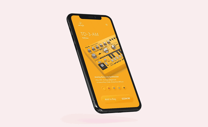
Behringer - Concept app
Opacity and motion transition, for product colour selection in Behringer concept app. Neumorphic design and animation created with Figma and Principle. Neumorphic design appears to extrude from the background. The effect is achieved by manipulating two shadows, one at negative values and the other at positive. Using Figma-Principle sync integration, the design could be tweaked and automatically updated after being imported into Principle.
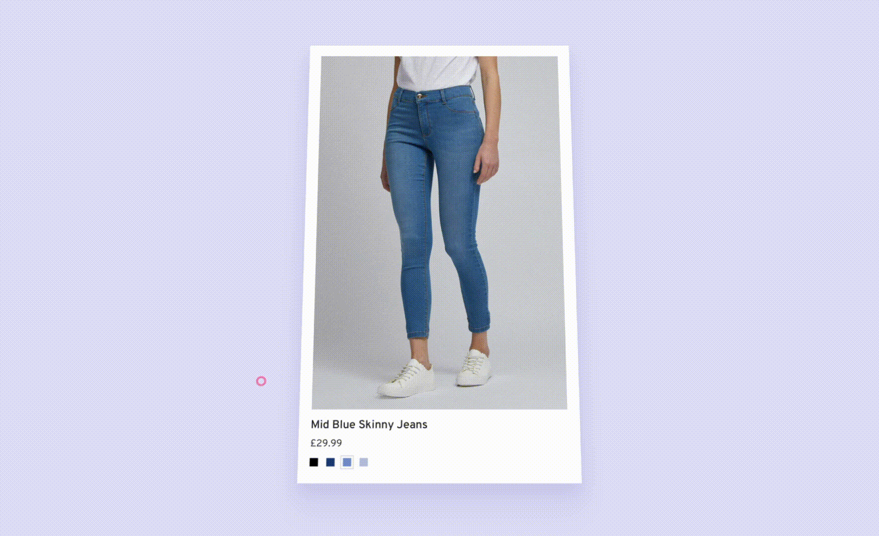
Topshop - Quick add to bag
Challenge Increase the amount of items a user adds to their bag by reducing the number of interactions required. To add an item to bag, the user currently has to either use the ‘Quick VIew’ overlay, or navigate to the ‘Product Description Page’. Both of these flows require four clicks to complete the process. Data has shown that users with a greater number of items in their bag are more likely to checkout. By eliminating friction from the process, a higher conversion rate is hypothesised.
Process A meeting with stakeholders from the Arcadia brands was held to define specific requirements, highlight any technical limitations and discuss the desired outcomes of the project. Rough sketches were shared with stakeholders to help visualise our concepts. After wireframing, interactive prototypes were created and iterated until an effective solution was agreed upon. A high fidelity prototype was created which would later serve at the development phase.
Solution On desktop, when the user hovers over a product image on the Product List Page, a panel appears at the bottom of the image to allow the user to see what sizes are in stock/low stock, and then select a size to add to their bag. For mobile and tablet, a CTA link was added which activates a selection menu containing size and stock information. Variants were created to handle products which have petite/standard/tall variants, and a scrollable panel was designed for large lists of size variants e.g. jeans.